GOOD TO GO
How’s your online presence keeping up with the trend toward mobile searching?
Is your website good to go? Does it look at least as good — and load at least as fast, and have at least as much functionality — on a smartphone, tablet or phablet as it does on a desktop computer? That’s more important every day since, as Daniel Feldman points out in his column in this issue, a whopping 60 percent of all Internet surfing now takes place on mobile devices. (And that was according to a report from last July, the equivalent of a few decades in Internet years.)
For this feature, we zoomed in on home pages, both mobile and full-size versions. That’s because first impressions really do count:You have only about 15 seconds to impress the average person searching online.
Advertisement
“It’s important to think like the patient and to give him what he wants to see: what the practice feels like, where it’s located, and how to make contact,” says Rod Yost, president of EyeMotion, which designs websites for ECPs.
We offer a few site critiques below. Test drive your own online presence, then read Feldman’s column here for more ways to get your site in gear to do its job on all platforms in 2015. — By JULIE FANSELOW
This article originally appeared in the February 2015 edition of INVISION.
Advertisement
TRUE VISION
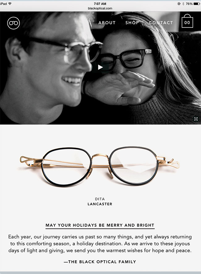
Black Optical, Oklahoma City and Tulsa, OK
➤ Black Optical woos new customers and wows longtime fans with short, seasonally changing homepage videos. (The winter 2014-2015 edition, filmed in Oklahoma and Texas, features a man and woman separately recalling a train ride, longing for their reunion.) The mini-films subtly reel in the viewer, all while showcasing eyewear you simply must own. Darshan Phillips, Black Optical’s creative director, says an email announcing a new video nets 40 percent more website clicks than the usual blast. blackoptical.com

Advertisement
BEST FACES FORWARD
Eyes on Chagrin, Woodmere, OH
➤ Owner/optician Kevin Kretch worked with longtime friend and graphic designer Rob Shimits to design a new site. Since its debut a year ago, it has boosted site traffic by up to several hundred total visits each month, many from newcomers. The duo decided to go with what they call a “hero image” that would look good on any device, along with this succinct value statement: “We’re here to help you see more clearly, & clearly look great.” The pairing resonates with the suburban shop’s target demographic of luxury-minded yet value-conscious adults. eyesonchagrin.com
LESS IS MORE
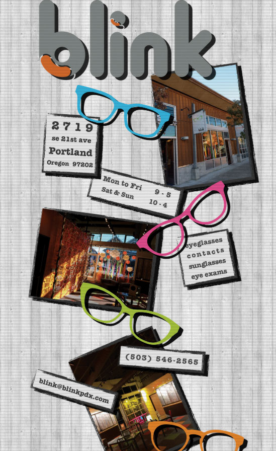
Blink, Portland, OR
➤ Blink’s website is exactly one page, but it has all the essentials — hours, location, phone, email and services offered — presented in black, white and gray with pops of color and three photos that give you a sense of place. The no-nonsense feel yet overall visual appeal does the job for a shop that is so busy that it doesn’t need to do much marketing. Still, if we ran the joint, we’d possibly include a link for easy access to the glowing Yelp reviews. blinkpdx.com
WORK THE ANGLES
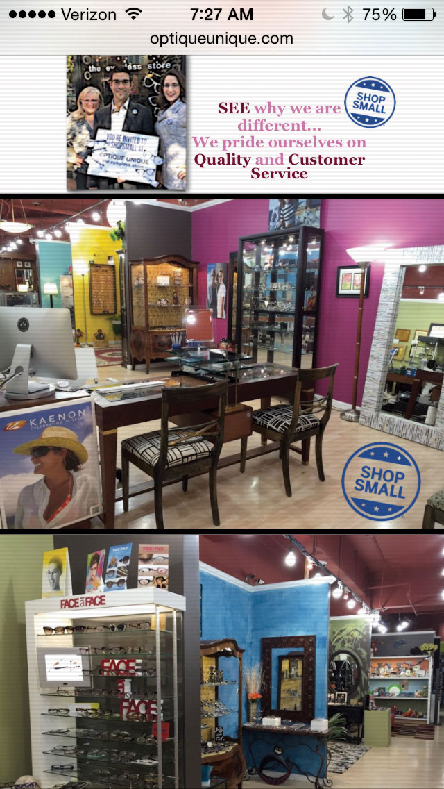
Optique Unique, Metuchen, NJ
➤ Optique Unique’s website couldn’t be more different than Black Optical or Blink’s — and it won’t win any design awards — but its mishmash still works. Optician-owner Barry Montalto has stuffed his home page with “Shop Small” logos, high-end brand shoutouts, photos of the good-looking shop (and adorable kids) and personal messages to would-be clients. We’d move the powerful visuals to the top, but keep the easy-to-find hours, address and phone number up there, too. optiqueunique.com
GET HELP NOW
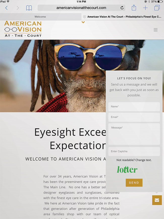
American Vision at the Court, King of Prussia, PA
➤ Click the little envelope icon on this home page and it whisks you to a contact form pop-up with the compelling headline “Let’s Focus on You!” Other features of the home page include striking brand photography and not one but two links to the online exam scheduling tool. Site designer Daniel Feldman says the business owners were “terrific to work with … very open about new ideas, and one of the things we did to make their store look big was to take a panorama shot of the inside.” americanvisionatthecourt.com
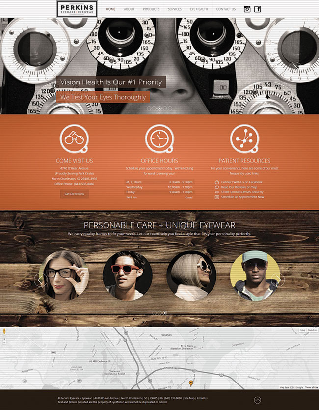
GOOD LOOKS
Perkins Eyecare + Eyewear, North Charleston, SC
➤ This attractive website designed by EyeMotion has several prominent pitches. For the fashion-conscious: “The Destination for Unique Eyewear that Defines Your Personal Style.” For parents of young children: “Healthy Vision For Life. Start Early and Get Yearly Eye Exams.” For the culture club: “A Relaxed Shopping Experience in an Art-Infused Atmosphere.” For everyone: “Vision Health is Our #1 Priority.” Icons make hours, location and favorite links easy to find. perkinseye.com