IN 2017 DR. KELSEY KELTGEN and her husband Mitch Peterson opened SEEK Eye Care, an independent optometry practice in Victoria, MN, a small town west of the Twin Cities. From the start, these high school sweethearts had twin goals: a comprehensive, high-tech optometric practice accompanied by a unique but approachable optical. The goal, Peterson says, was to create a “low stress, fun experience.” Paradoxically, the effort to create a distinctive brand leaves many retail businesses feeling cookie-cutter cool, or just too slick. SEEK avoids falling into this trap, projecting a vibe that’s sharp, but human and, yes, approachable.
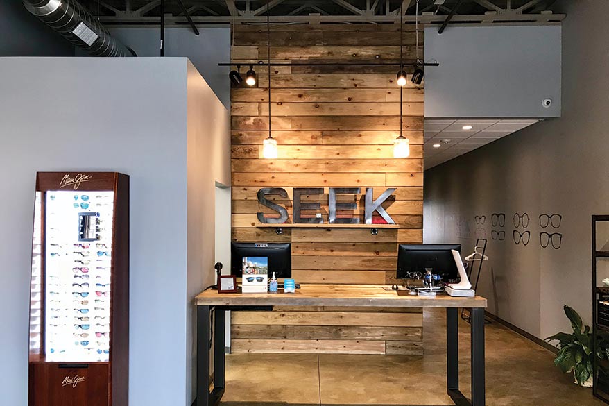
SEEK’s decor is rich in wood accents with a twist of industrial chic. Keltgen and Peterson, who funded the new business on their own, designed and hand-built the store’s frame boards and eyewear displays. “We had some help from a few family friends but other than that we did all of our own design work and concepts between my wife, our manager Rachel and myself,” Peterson says.
Advertisement
The branding effort started with SEEK’s logo, which incorporates a pair of glasses with frosted lenses framed in the company colors: purple and teal (Keltgen’s favorites). “I wanted something catchy, clean looking and easy to remember,” Peterson says.
The look was designed to be memorable but not elitist. “Too many times opticals get stuck in the cutting-edge fashion world. I think those stores have a place; it’s just not what we wanted to do. We are a bit more down-to-earth than our immediate competitors and that’s why our patients become SEEK fans,” he adds.
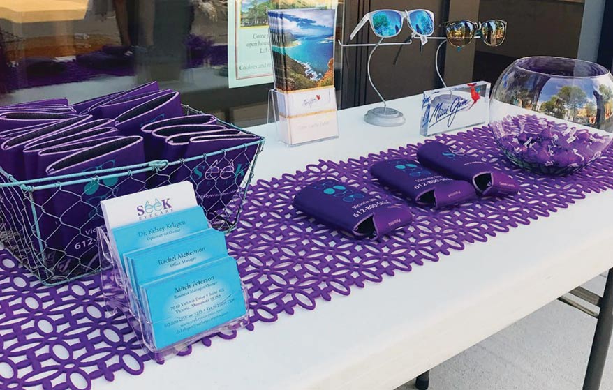
SEEK’s twin colors are a familiar sight at the local car show every other Wednesday right outside the location’s door. Peterson made up a couple thousand koozies to hand out with SEEK’s name plastered on them. “Guess what … they were purple and teal. It was an instant hit. This year we have glow in the dark bracelets to hand out. Our SEEK fans are asking for giveaways to show off to everyone.”
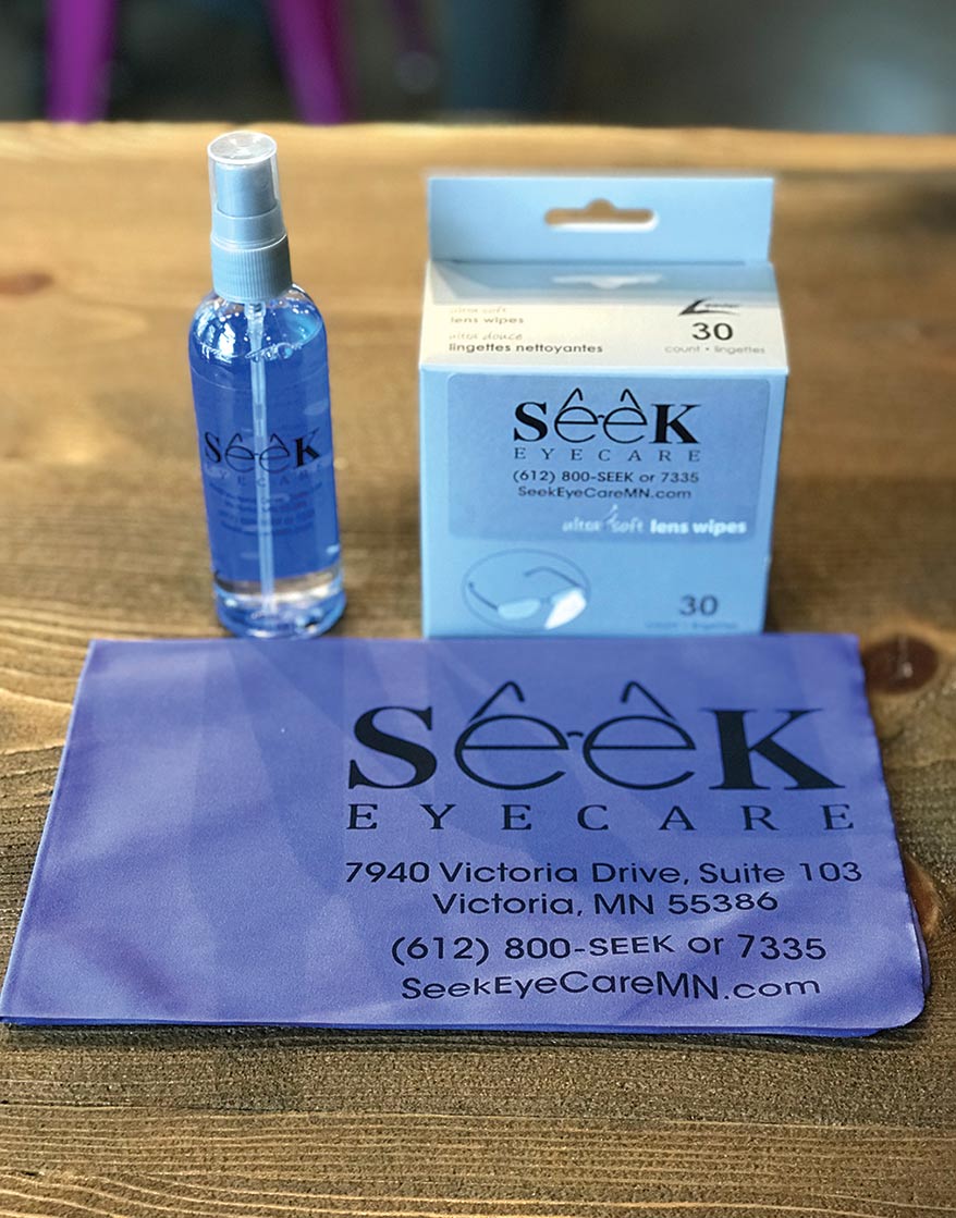
In the reception area and on signage the business’ strong, short, visually themed name is rendered in all caps; it also forms the basis for the logo, always rendered in a font chosen for clarity. The logo festoons a range of material from lens cloths to lens wipes and solution.
Aside from keeping it clear and consistent, from the colors to the logo, Peterson’s advice is to always keep in mind the whole picture that you’re trying to present: “Too many ECPs just focus on their name, and not their full image.”

A Capital Idea
In the reception area and on signage SEEK’s strong, short, visually themed name is rendered in capital letters.
Advertisement

Brewing Up a Brand
For the local car show, Peterson made up a couple thousand koozies to hand out with SEEK’s name plastered on them.

Seamless
SEEK’s logo adorns everything from contact solution to lens cloths and wipes.